Schedule & Save (S&S) is a subscription program that provides Albertsons customers with convenience, predictable savings, and flexible replenishment. However, the legacy email and SMS communication system was inconsistent, unclear, and underperforming in engagement. This project focused on redesigning the S&S communication experience to improve clarity, increase customer interaction, and help customers confidently understand and manage their subscriptions.
| Problem Statement
Schedule & Save (S&S) communication is designed to offer customers
convenience, savings, and flexibility. However, the existing
design lacked clarity, consistency, and excitement. Customers
often didn’t understand the benefits of the program, the
flexibility it offered, or how to manage their subscriptions based
on where they were in their journey. As a result, communication
touchpoints were underperforming and failing to support the
overall S&S experience.
To improve engagement and build customer confidence, we redesigned
the communication experience—providing clear, consistent, and
actionable messages across the S&S lifecycle so customers always
know what they can do, why it matters, and how to optimize their
subscription.
| Target Audience
Customers across Albertsons Companies’ 20+ retail banners—including Safeway, Albertsons, Shaw’s, Vons, Jewel-Osco, and more—who are enrolled in email subscription programs.

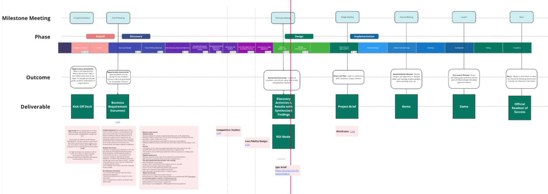
I typically follow a Double Diamond design process to clearly define problems, explore ideas, and deliver solutions. I use tools like Miro and Loop to document and track the design process, which helps keep the project on course and improves alignment and pacing between design and development.
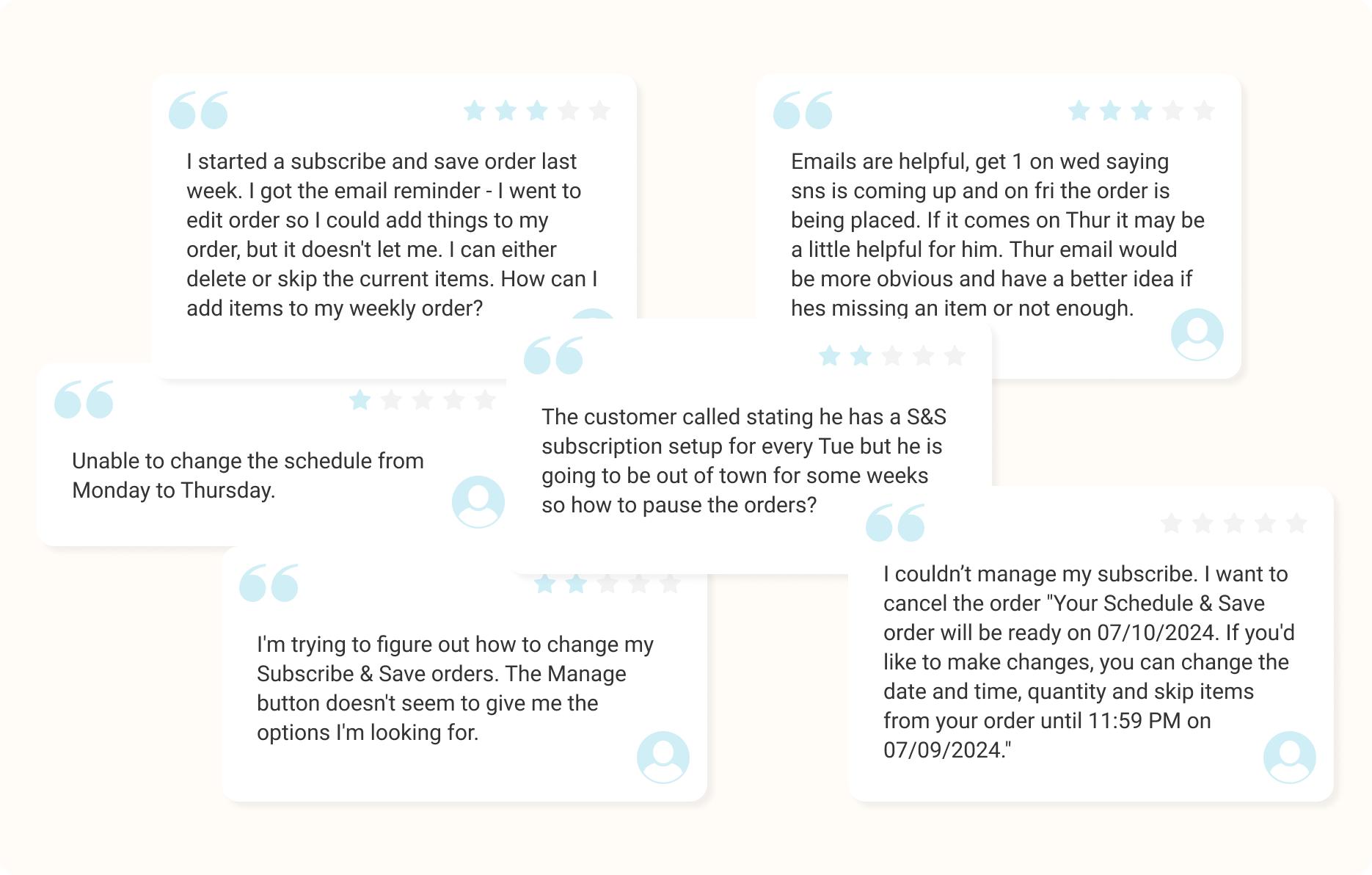
| What Customers Say?
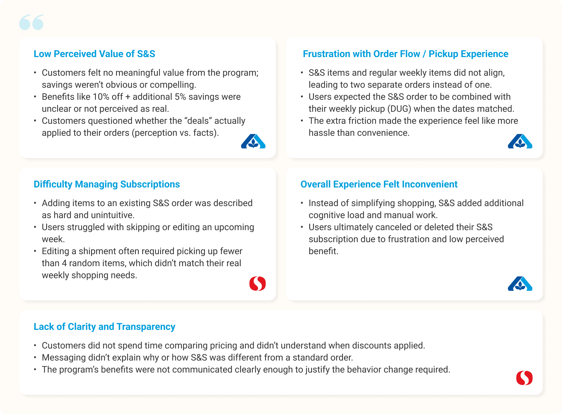
To understand real customer frustrations, we reviewed feedback from multiple channels including Qualtrics survey responses, app reviews, and customer support tickets. These insights revealed consistent themes around unclear value, difficulty managing subscriptions, and a general perception that S&S created more hassle than convenience.
| What Internal Team Members Say?
We also met with team members from Own Brands team (Customer Service and Marketing)—groups who interact with customers daily and hear their pain points firsthand. Their perspective helped us validate customer frustrations, uncover operational challenges, and identify areas where communication and experience gaps were most visible.
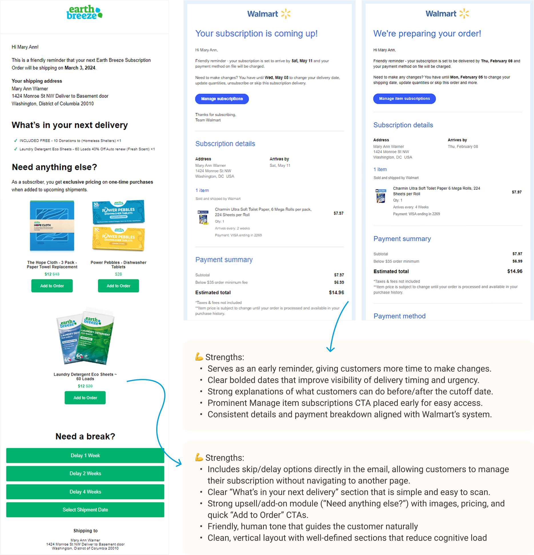
| Competitive Analysis
To better understand industry standards and identify opportunities for improvement, we conducted competitive research on leading subscription and replenishment programs. Here are some of the key patterns and best practices we uncovered.
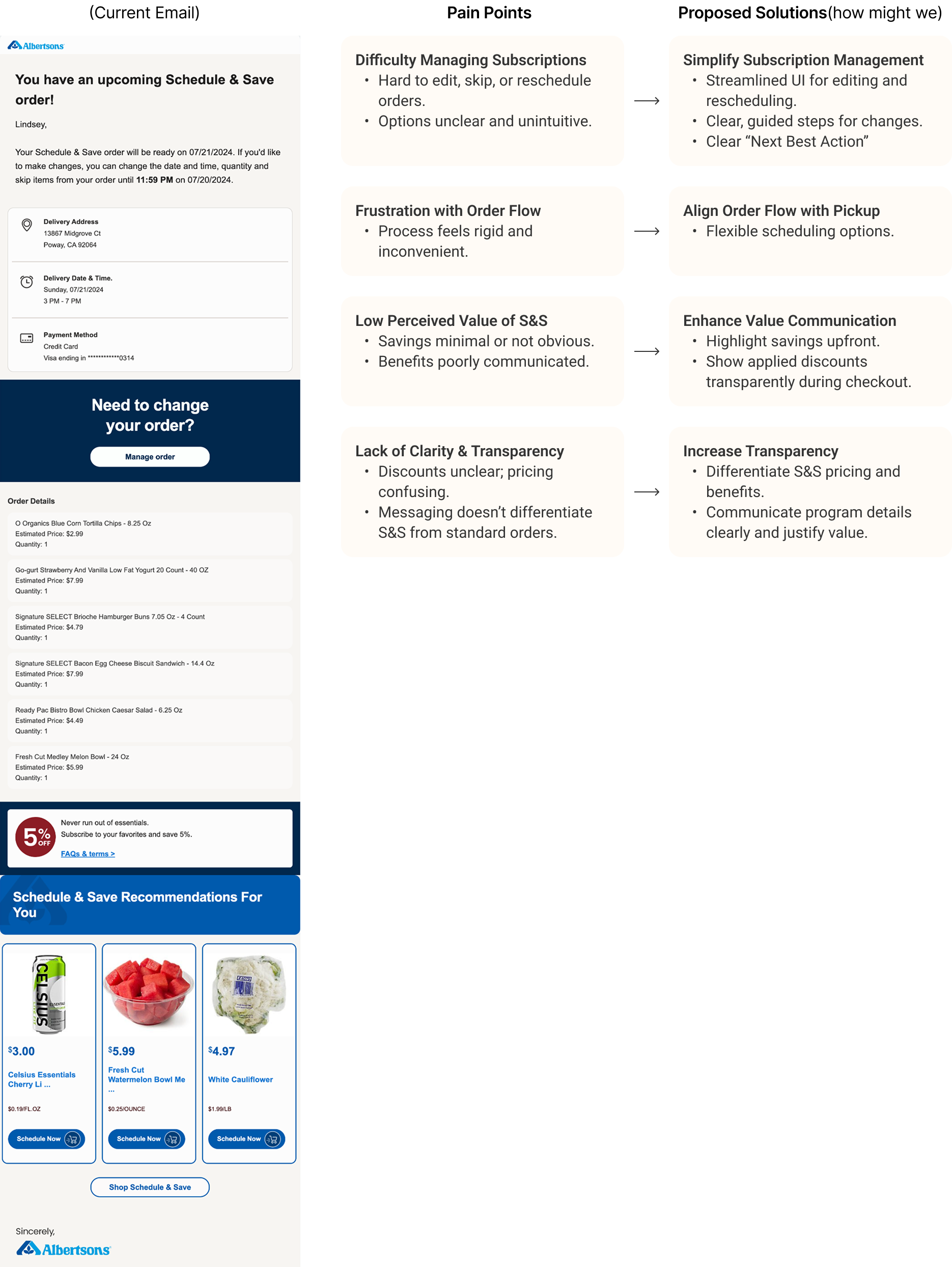
| Pain Points and proposed solutions(how might we)
After conducting both primary and secondary research, I synthesized stakeholder feedback into key pain points and mapped them to actionable, user-centered solutions. This approach ensures that the proposed improvements directly address real challenges and align with business goals.
After developing design proposals based on customer pain points, I summarized key areas of focus for the upcoming Ideation phase. My goal is to combine empathetic thinking with established design principles to create solutions that are both user-centered and technically sound
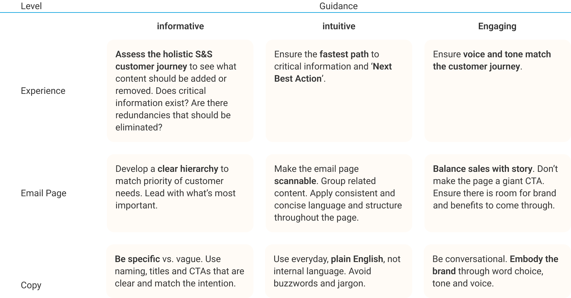
| Content Principles
In this round of optimization, we are aiming to use an informative, intuitive, and engaging voice to ensure the content is clear, concise, and consistent.
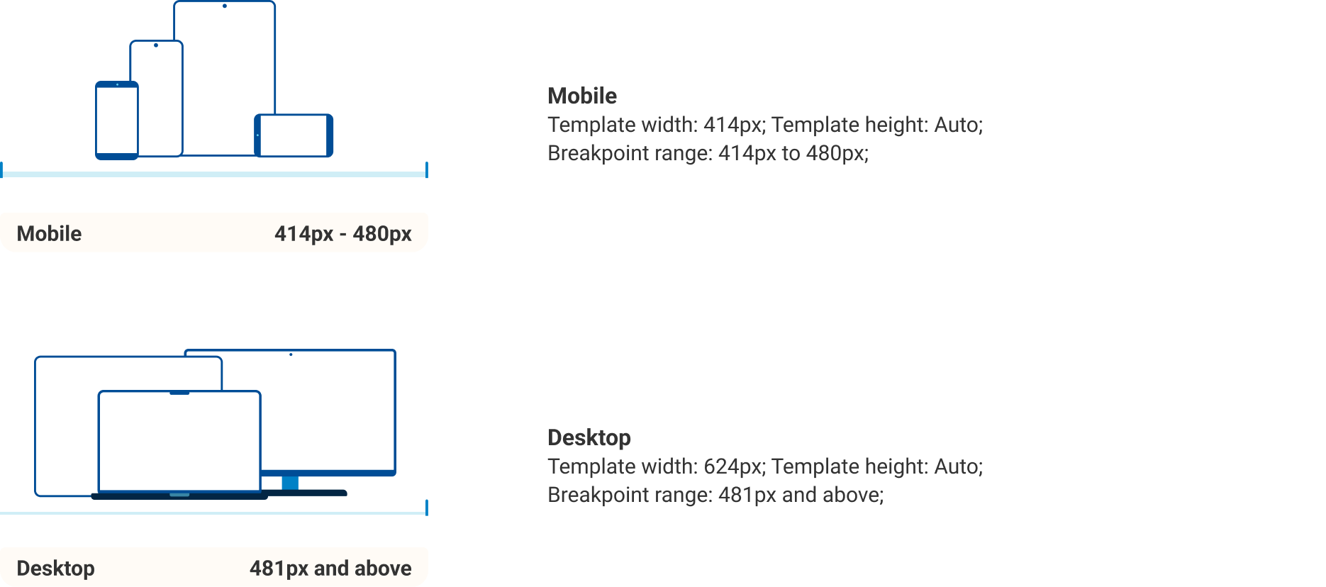
| Breakpoints
We are also introducing breakpoint guidelines to support responsive design. Breakpoints define where layouts adapt for different screen sizes, ensuring templates work well across common devices.
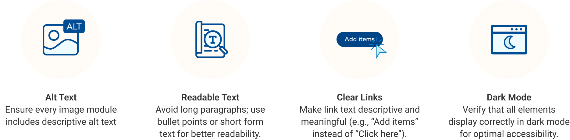
| Accessibility
Albertsons has adopted the W3C WAI Web Content Accessibility Guidelines (WCAG) Level AA as the standard for all digital experiences. When redesigning emails, I also consider practical accessibility principles such as:
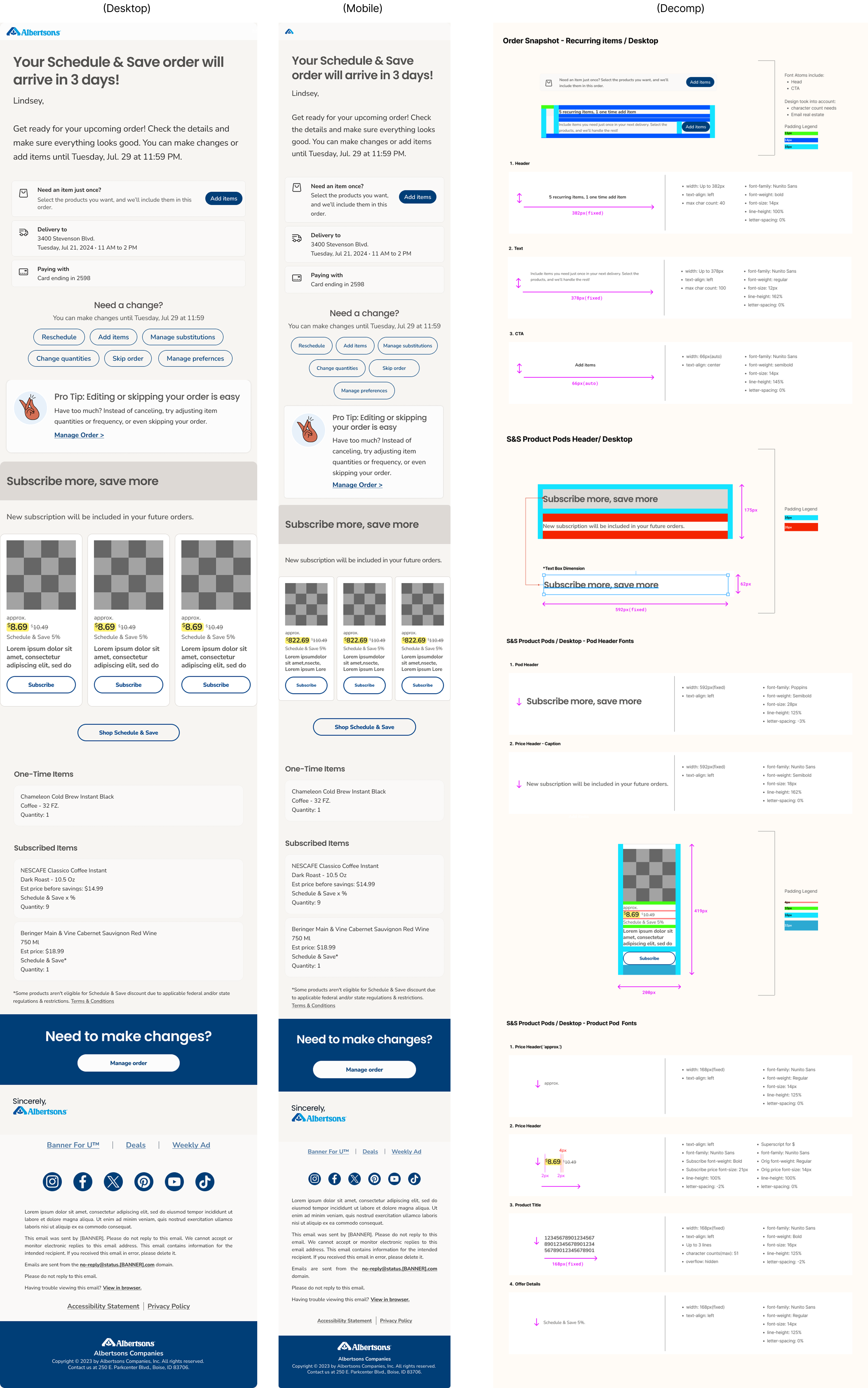
Based on the Research, Ideation, and Brainstorming, I tried to translate the ideas into prototypes.
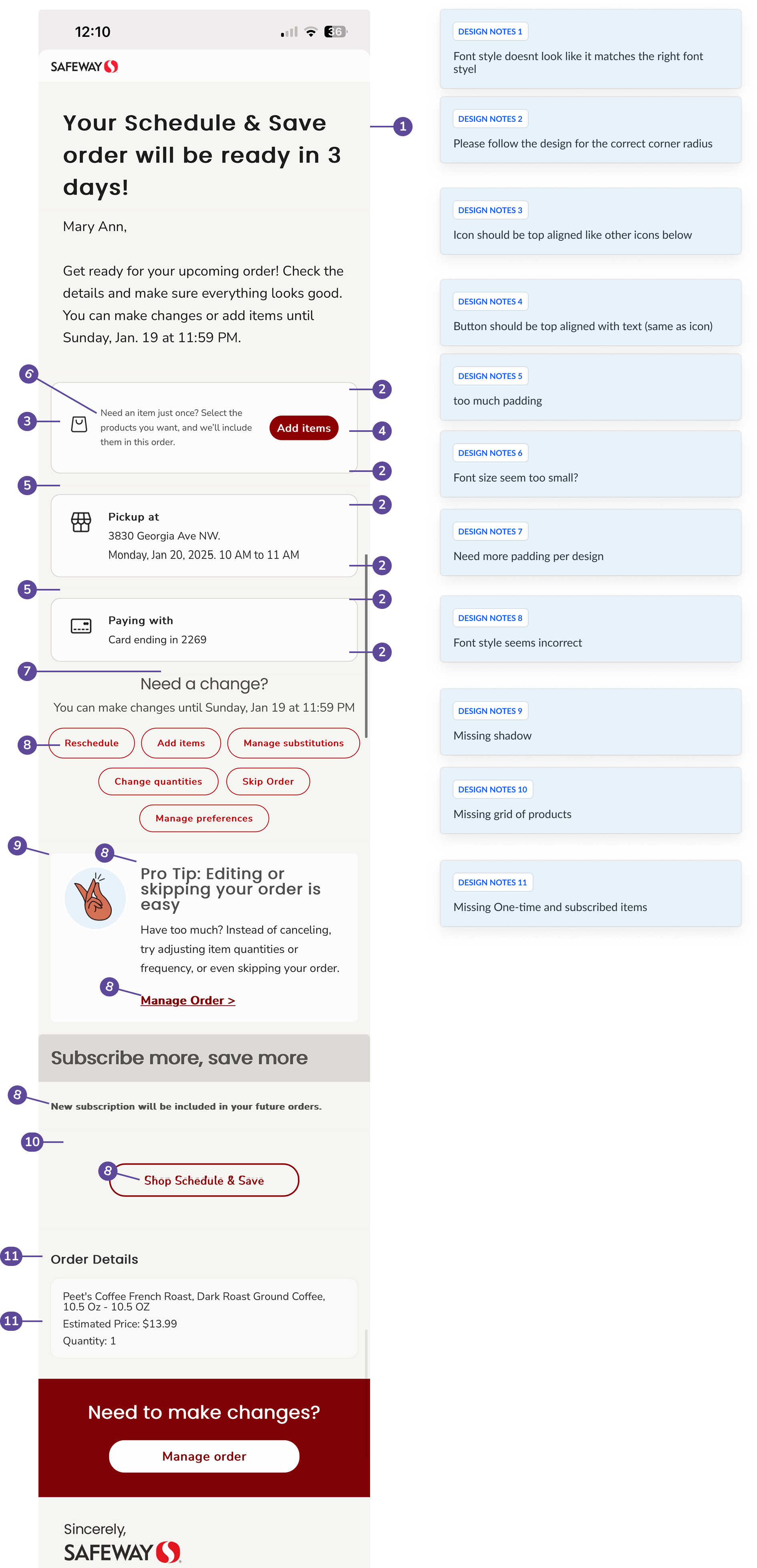
One pain point I identified at Albertsons was the lack of UX involvement between development completion and QA. Since QA was not always familiar with the design intent, inconsistencies sometimes appeared between the final build and the approved designs. To address this, I introduced a lightweight UIQA step by reviewing screens with developers before QA handoff, helping catch issues earlier.
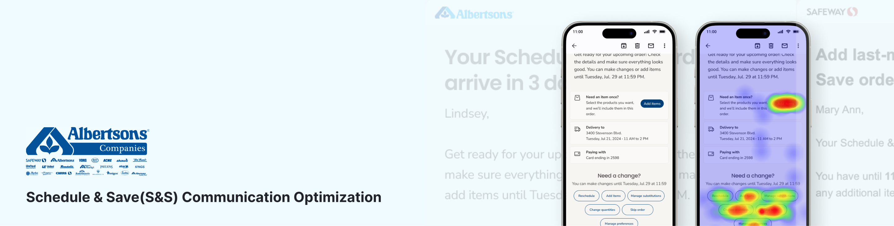
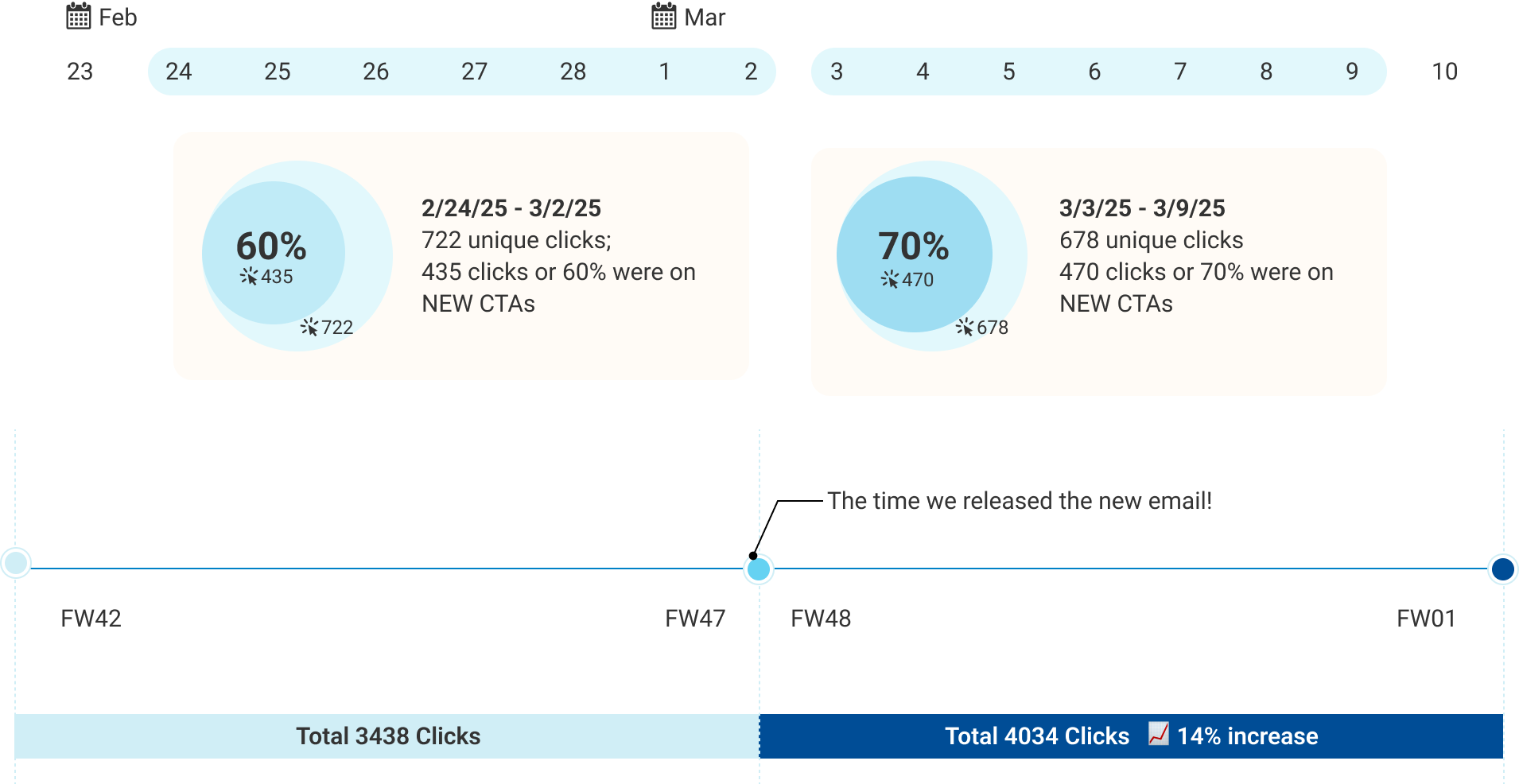
| Click Rate
We’re seeing great early results after the updated S&S email launch—total clicks are up 14% (3438 → 4034), and engagement with new CTAs jumped from 60% to 70%, showing the refreshed design is really driving interaction.
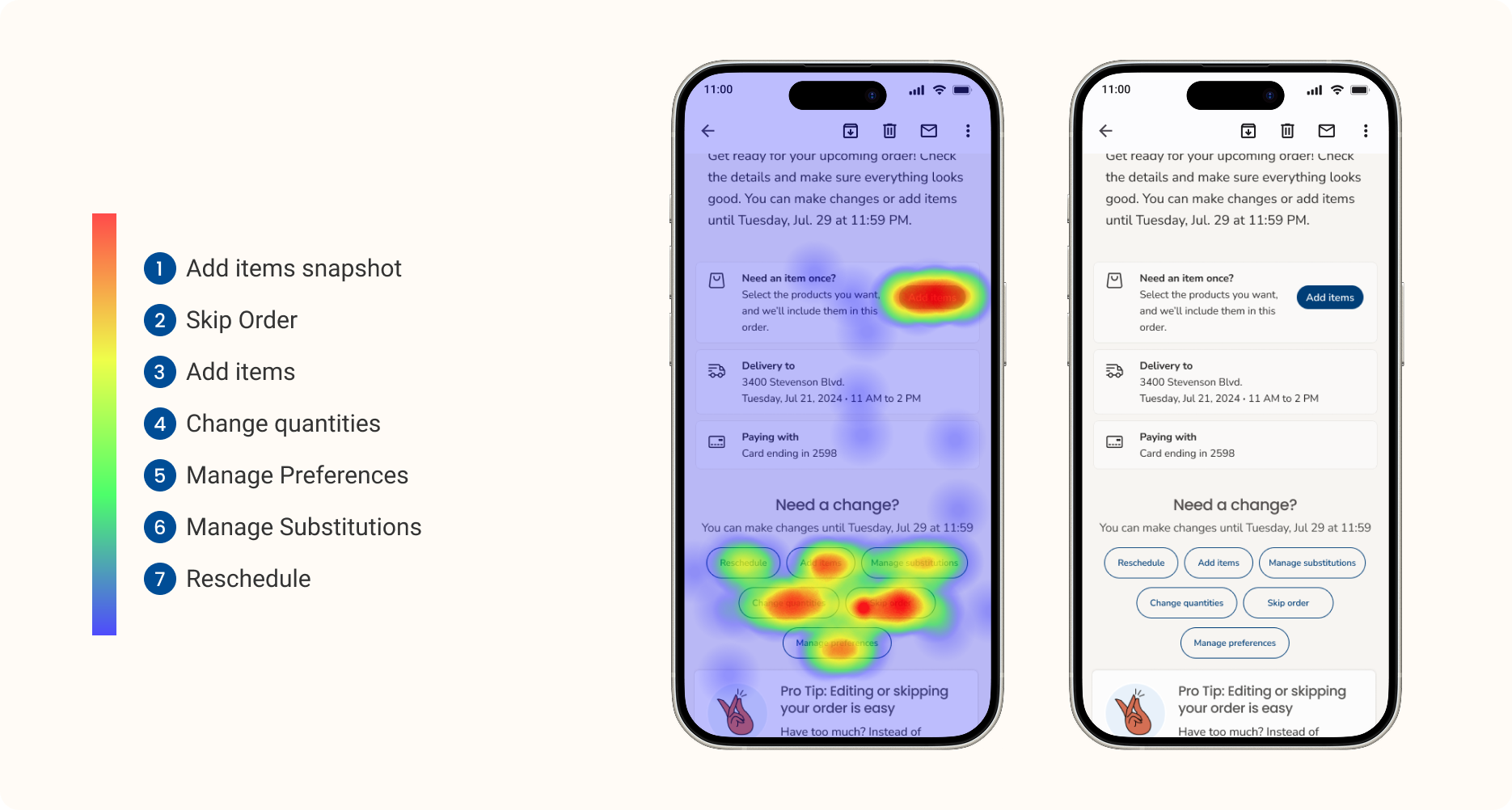
| What Our Customers Clicked the Most ?
Also, early results show strong engagement with interactive elements: heatmaps indicate high activity around “Add items snapshot,” “Add items,” and “Manage preferences,” confirming that users are actively exploring customization options in the updated design.